HTML、JS、CSS
编辑器
下载vscode, 全称Visual Studio Code
HTML
网页的基本架构
1
2
3
4
5
6
7
8
9
10
11
12
13
| <html lang='en'> //根标签,“lang='en'”语言为英语
<head> // 头部标签,类似python的类引用
<meta charset="utf-8"> // 网页的编码格式,如 utf-8, gb2312, gbk.......
<title>标签名</title> // 网页的标签名
</head>
<body>
存储网页显示的内容
</body>
</html>
|
title标签的作用
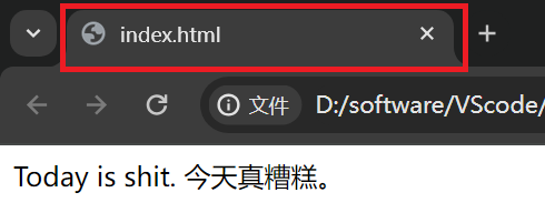
这是没有设置title标签时的状态
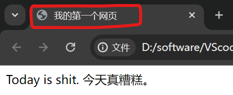
这是设置之后的状态。
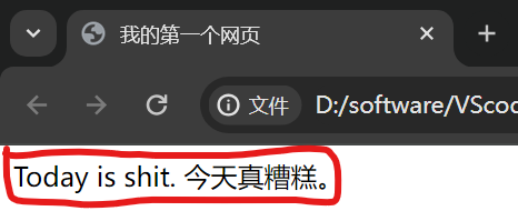
body标签的作用
显示页面的内容
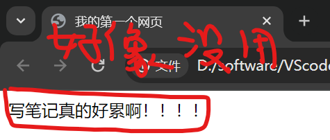
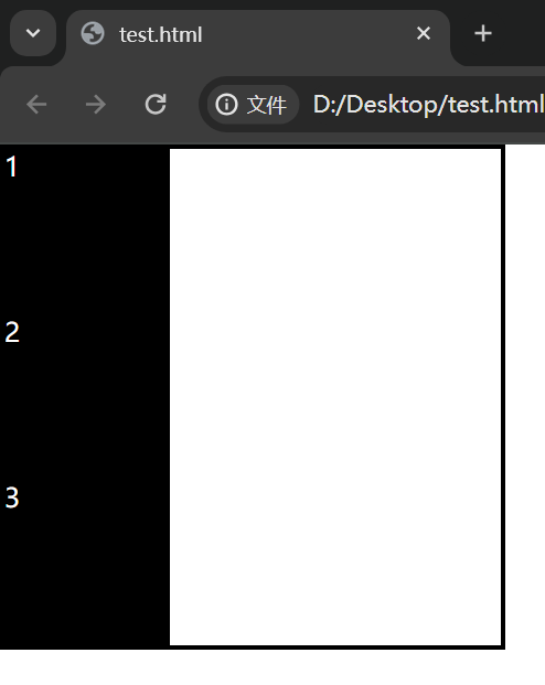
p标签的作用
将内容成段显示
1
2
3
4
5
6
7
8
9
10
11
12
| <html>
<head>
<title>我的第一个网页</title>
</head>
<body>
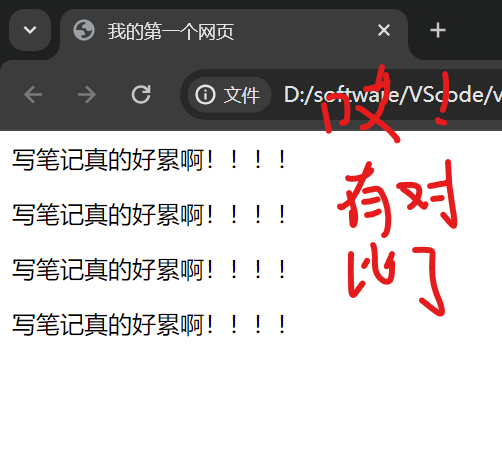
<p>
写笔记真的好累啊!!!!
</p>
</body>
</html>
|
1
2
3
4
5
6
7
8
9
10
11
12
13
14
15
16
17
18
19
20
21
| <html>
<head>
<title>我的第一个网页</title>
</head>
<body>
<p>
写笔记真的好累啊!!!!
</p>
<p>
写笔记真的好累啊!!!!
</p>
<p>
写笔记真的好累啊!!!!
</p>
<p>
写笔记真的好累啊!!!!
</p>
</body>
</html>
|
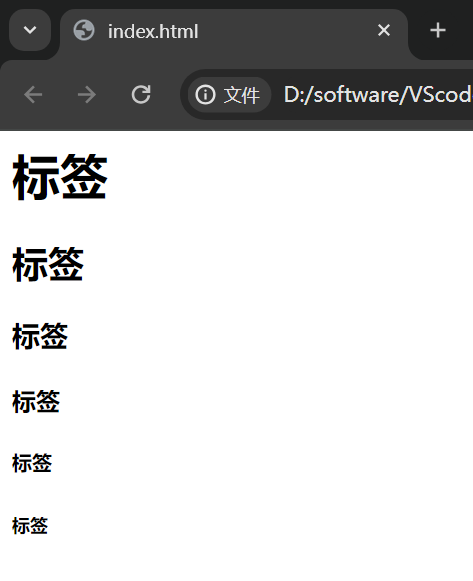
h什么标签的作用
1
2
3
4
5
6
7
8
9
10
11
12
13
14
| <html>
<head></head>
<body>
<h1>标签</h1>
<h2>标签</h2>
<h3>标签</h3>
<h4>标签</h4>
<h5>标签</h5>
<h6>标签</h6>
</body>
</html>
|
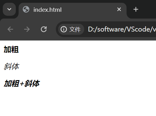
加粗、斜体标签的作用
1
2
3
4
5
6
7
8
9
10
11
12
13
14
15
16
17
| <html>
<head></head>
<body>
<p>
<strong>加粗</strong>
</p>
<p>
<em>斜体</em>
</p>
<strong>
<em>加粗+斜体</em>
</strong>
</body>
</html>
|
div容器的作用
1
2
3
4
5
6
7
| <html>
<body>
<div></div>
</body>
</html>
|
初看毫无作用
1
2
3
4
5
6
7
8
9
10
11
| <html>
<body>
<div style="
width: 100px;
height: 100px;
background-color:#f14
"></div>
</body>
</html>
|
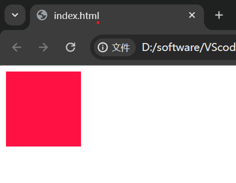
加入些样式后看见了,主要用来给网页分块,便于模块整理。
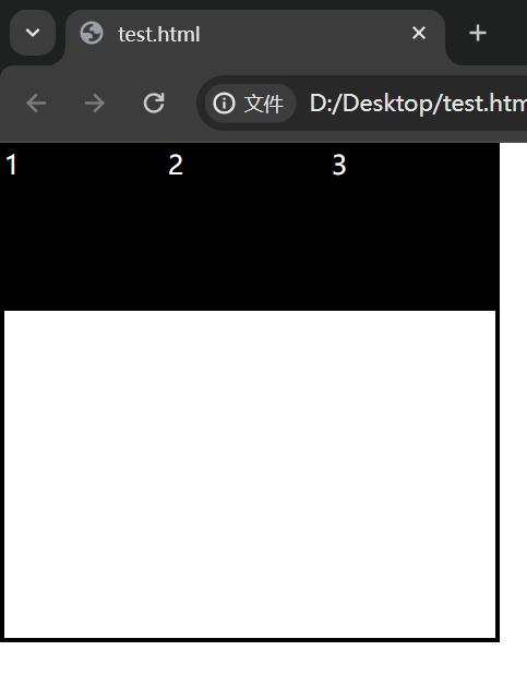
span标签的作用
1
2
3
4
5
6
7
| <html>
<body>
<span>我不是span标签,骗你的,哈哈</span>
</body>
</html>
|
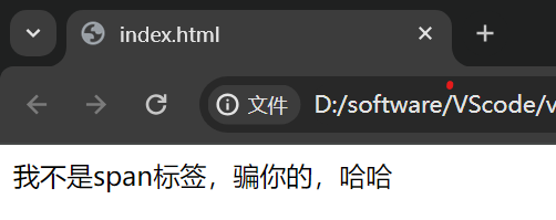
好像就是一段文本,没错,这标签就是显示文本的标签。
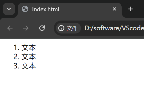
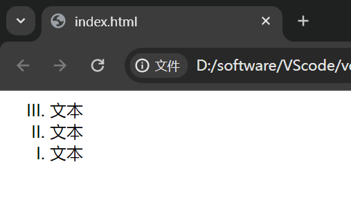
ol, li标签的作用
有序列表
1
2
3
4
5
6
7
8
9
10
11
| <html>
<body>
<ol type="1" start="1"> // type用来描述什么符号来标识顺序, 如1, a, i, I......
<li>文本</li>
<li>文本</li>
<li>文本</li>
</ol>
</body>
</html>
|
1
2
3
4
5
6
7
8
9
10
11
| <html>
<body>
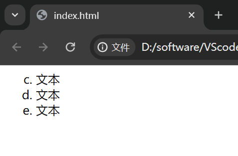
<ol type="a" start="3"> // start表示符号从几开始,如3, 4, 5......
<li>文本</li>
<li>文本</li>
<li>文本</li>
</ol>
</body>
</html>
|
1
2
3
4
5
6
7
8
9
10
11
| <html>
<body>
<ol type="I" start="3" reversed="reversed"> // reversed表示逆序
<li>文本</li>
<li>文本</li>
<li>文本</li>
</ol>
</body>
</html>
|
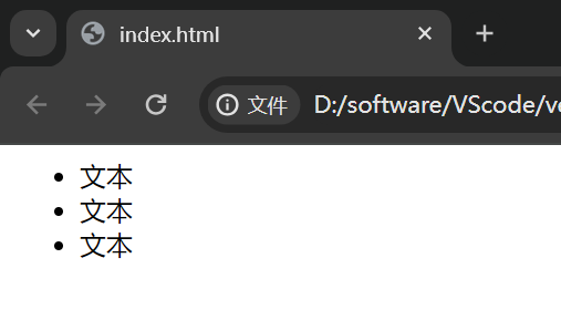
ul标签的作用
无序列表,可以用来做导航栏的骨架
1
2
3
4
5
6
7
8
9
10
11
| <html>
<body>
<ul>
<li>文本</li>
<li>文本</li>
<li>文本</li>
</ul>
</body>
</html>
|
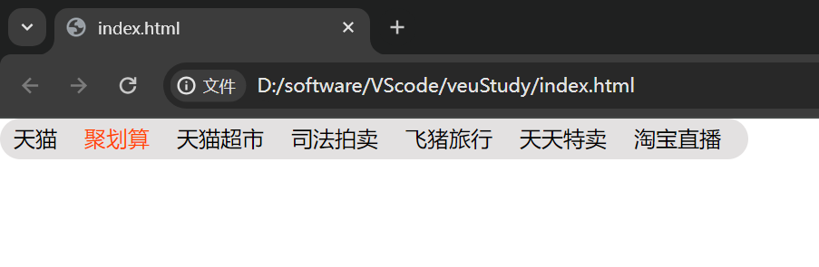
淘宝导航栏样例
1
2
3
4
5
6
7
8
9
10
11
12
13
14
15
16
17
18
19
20
21
22
23
24
25
26
27
28
29
30
31
32
33
34
35
36
37
38
39
40
41
42
43
44
45
46
| <html>
<head>
<style>
*{
margin: 0px;
padding: 0px;
}
div{
width: 550px;
height: 30px;
background-color: #e3e1e1;
border-radius: 15px;
}
ul{
list-style: none;
}
li{
float: left;
margin: 4px 10px;
}
li:hover{
color: #f40;
}
</style>
</head>
<body>
<div>
<ul>
<li>天猫</li>
<li>聚划算</li>
<li>天猫超市</li>
<li>司法拍卖</li>
<li>飞猪旅行</li>
<li>天天特卖</li>
<li>淘宝直播</li>
</ul>
</div>
</body>
</html>
|
CSS
1
2
3
4
5
6
7
8
9
10
11
| {
font-size: 50px; 字体大小
font-weight: lighter | bold | bolder; 字体加粗|变细
font-family: ;
font-style: normal; 字体样式
color: #f40; 字体颜色
border: 10px solid #000; 边框属性
border-radius: 20px; 圆角属性
margin: 0 10px; 外边距
padding: auto; 内边距
}
|
CSS引入方式
行内样式
1
| <div style="color:red;"> </div>
|
标签样式
1
2
3
4
5
6
7
8
9
10
11
| <html>
<head>
style{
div{
background-color: red;
}
}
</head>
</html>
|
外部样式
1
2
3
4
5
| <html>
<head>
<link rel="stylesheet" href="./htmlCss1.css">
</head>
</html>
|
CSS选择器
标签选择器
设置整个页面标签名叫{Tag Name}的样式
类选择器
可以在多个标签中设置class=”class_name”的类名,统一设置CSS样式,多对多
id选择器
id是英文identity的缩写,意思是身份,人的身份证是独一无二的,id也是一样,一个标签只能拥有唯一的id标识
父子选择器
父子选择器同名字一样是一种通过上下级关系来确定样式位置,并设置样式
1
2
3
4
5
| div .class_name #id_name{
内容样式
} 由上可知, div是.class_name的父级,.class_name是#id_name的父级
|
如果将父子关系比作一棵树,浏览器的内部是通过子节点向上寻找父节点的顺序来确定关系的
并列选择器
1
2
3
4
5
6
7
8
| <div></div>
<div class="box1"></div>
div.box1{
内容样式
} 给第二个div添加样式
|
分组选择器
1
2
3
4
5
6
7
8
9
10
11
12
13
14
15
16
17
18
| <div class="box1"></div>
<div class="box2" id="box1">
今天我真帅!
</div>
.box1{
background-color: red;
}
.box2{
background-color: green;
}
.box1,
.box2{
width: 100px;
height: 100px;
}
|
属性选择器
1
2
3
4
5
| [class="demo1"] {
样式内容
}
|
选择器之间的优先级关系
行内样式>id选择器>类选择器
CSS权重关系
1
2
3
4
5
6
| !important Infinity
行间样式 1000
id 100
class|属性|伪类 10
标签|伪元素 1
通配符 0
|
权重的比较是依靠相加的和值
盒子模型
1
2
3
4
5
6
7
8
| css_name{
position: absoult(绝对定位)/relative(相对定位)/fixed(固定定位)
margin: 10px; 外边距
padding: 10px; 内边距
border:10px(宽度) soild(实线) black(颜色);
width: 100px; 盒子的宽度
height: 100px; 盒子的高度
}
|
层模型
absoult 绝对定位,位置是相对于“有定位的父级容器”。
relative 相对定位,位置是相对于“本身出生的位置”。
fixed 固定定位,相对body,自测而得,还不确定。
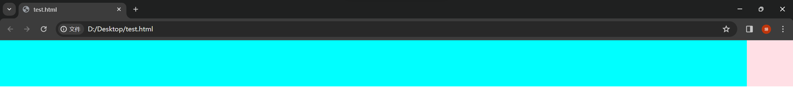
对absoult的测试
1
2
3
4
5
6
7
8
9
10
11
12
13
14
15
16
| <div class="box1"></div>
<div class="box2"></div>
.box1{
position: absolute;
width: 100px;
height: 100px;
background-color: #3ff;
opacity: 0.5;
}
.box2{
width: 300px;
height: 300px;
background-color: pink;
}
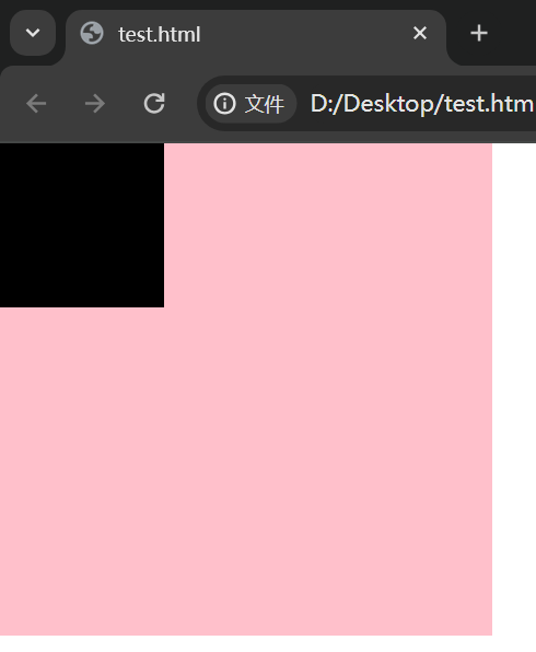
|
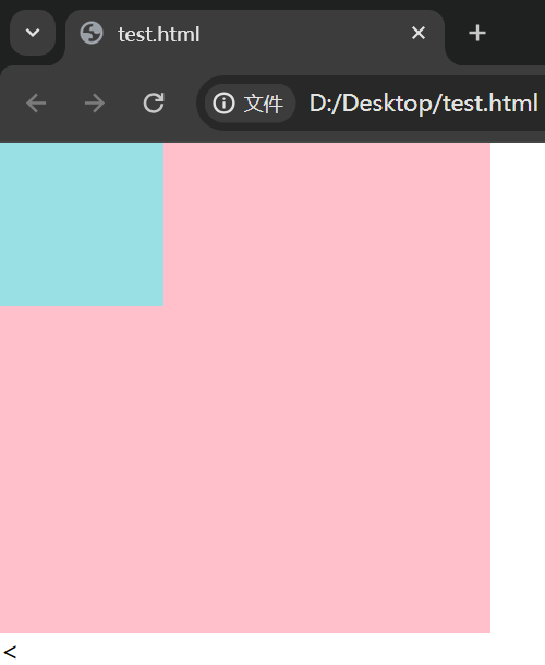
设置”position: absolute;”之后原本块级元素和行级元素都会看不见它,从来变成了重叠。
对relative的测试
1
2
3
4
5
6
7
8
9
10
11
12
13
14
15
16
17
18
19
20
21
22
23
24
25
26
27
28
29
30
| <div class="box2">
<div class="box1">
<div class="box3"></div>
</div>
</div>
.box1{
position: absolute;
right: 0;
bottom: 0;
width: 200px;
height: 200px;
background-color: #3ff;
opacity: 0.5;
}
.box2{
position: relative;
width: 300px;
height: 300px;
background-color: pink;
}
.box3{
position: relative;
width: 100px;
height: 100px;
background-color: black;
opacity: 0.5;
}
|
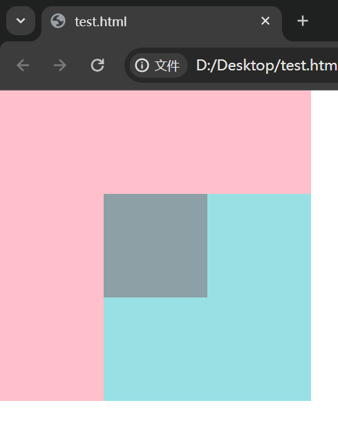
1
2
3
4
5
6
7
8
9
10
|
.box3{
position: relative;
left: 50px;
top: 50px;
width: 100px;
height: 100px;
background-color: black;
opacity: 0.5;
}
|
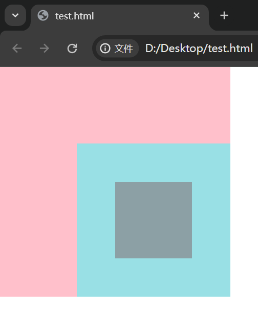
1
2
3
4
5
6
7
8
9
10
|
.box3{
position: relative;
right: 50px;
bottom: 50px;
width: 100px;
height: 100px;
background-color: black;
opacity: 0.5;
}
|
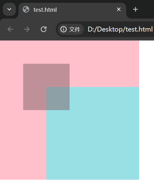
通过对比,惊奇的发现属性”position: relative;”它的定位是基于自己出生时的边界来定位的。
float属性特讲
1
2
3
4
5
6
7
8
9
10
11
12
13
14
15
16
17
18
19
20
21
|
<div class="demo1">
<div class="content">1</div>
<div class="content">2</div>
<div class="content">3</div>
</div>
.demo1 {
width: 300px;
height: 300px;
border: 3px solid black;
}
.demo1 .content {
width: 100px;
height: 100px;
background-color: black;
color: white;
}
|
1
2
3
4
5
6
7
8
|
.demo1 .content {
float: left;
width: 100px;
height: 100px;
background-color: black;
color: white;
}
|
1
2
3
4
5
6
7
8
|
.demo1 .content {
float: right;
width: 100px;
height: 100px;
background-color: black;
color: white;
}
|
总结发现,属性”float: left;”是将原来的块级元素从左到右的排列,属性”float: right;”是将原来的块级元素从右到左的排列。
对float层关系的测试
1
2
3
4
5
6
7
8
9
10
11
12
13
14
15
16
|
<div class="box1"></div>
<div class="box2"></div>
.box1 {
float: left;
width: 100px;
height: 100px;
background-color: black;
}
.box2 {
width: 300px;
height: 300px;
background-color: pink;
}
|
1
2
3
4
5
6
7
8
9
10
|
<div class="box1"></div>
<img src="https://dss3.baidu.com/-rVXeDTa2gU2pMbgoY3K/it/u=461303309,1100799494&fm=202">
.box1 {
float: left;
width: 100px;
height: 100px;
background-color: black;
}
|
通过对比发现,float属性设置后,块级元素是会看不见的,但是行级元素依旧看得见,并按规则展示在后方。
float的这种效果称之的浮动元素产生的浮动流
浮动元素产生的浮动流,块级元看不见他们
产生了bfc的元素和文本类属性(inline)的元素以及文本都能看到浮动元素
两栏布局实现方法
1
2
3
4
5
6
7
8
9
10
11
12
13
14
15
16
17
| <div class="demo1"></div>
<div class="demo2"></div>
.demo1 {
position: absolute;
right: 0;
width: 100px;
height: 100px;
background-color: pink;
opacity: 0.5;
}
.demo2 {
height: 100px;
background-color: aqua;
margin-right: 100px;
}
|
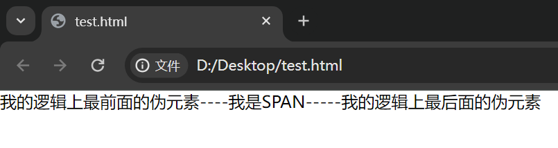
伪元素的补充
1
2
3
4
5
6
7
8
9
10
| <span>我是SPAN</span>
span::before {
content: "我的逻辑上最前面的伪元素----";
}
span::after {
content: "-----我的逻辑上最后面的伪元素 ";
}
|
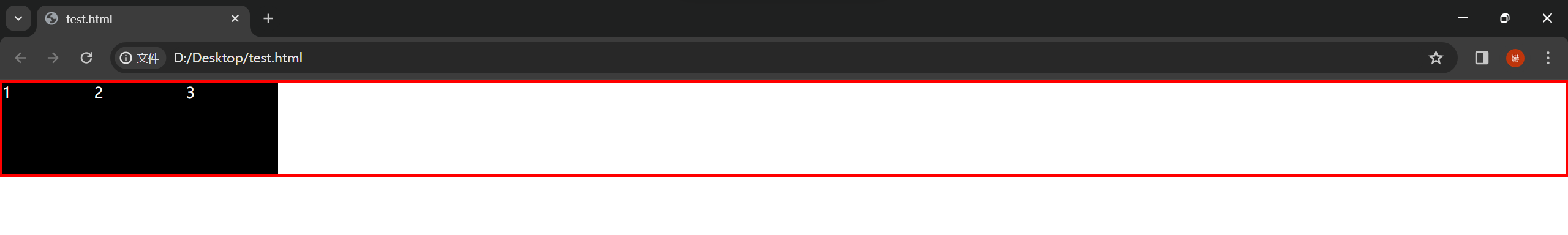
实战样例:父级容器包裹子级容器
1
2
3
4
5
6
7
8
9
10
11
12
13
14
15
16
17
18
19
|
<div class="demo1">
<div class="content">1</div>
<div class="content">2</div>
<div class="content">3</div>
</div>
.demo1 {
border: 3px solid red;
}
.demo1 .content {
float: left;
width: 100px;
height: 100px;
background-color: black;
color: white;
}
|
1
2
3
4
5
6
7
8
9
10
11
12
13
14
15
|
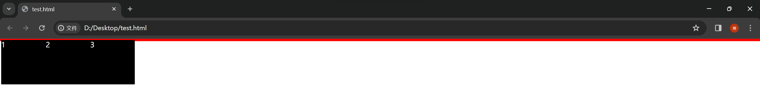
<div class="demo1">
<div class="content">1</div>
<div class="content">2</div>
<div class="content">3</div>
<p></p>
</div>
p {
clear: both;
}
|
1
2
3
4
5
6
7
8
9
10
11
12
13
14
15
16
17
18
19
20
21
22
23
24
25
26
27
28
29
|
<div class="demo1">
<div class="content"></div>
<div class="content"></div>
<div class="content"></div>
</div>
.demo1 {
border: 3px solid red;
}
.demo1 .content {
float: left;
width: 100px;
height: 100px;
background-color: black;
color: white;
}
.demo1::after {
content: "";
clear: both;
display: block;
}
|

JS

 wechat